
Stacked 3D Layers
We’ll create a 3d stacked effect with text and an image!
This technique uses transform-style: preserve-3d and translateZ() to make elements appear to “pop” off the background when the HoverTilt component is interacted with.
Different elements can have different Z depths, creating a stacked parallax effect.
We’ll be using --hover-tilt-opacity to control the Z depth of the elements, and --shadow-x & --shadow-y to control the shadow positions.
Stacked 3D Effect
Section titled “Stacked 3D Effect”Here we will place a container inside the <hover-tilt> component slot, and inside of that we’ll put
some graphics that appear to pop out when hovered.
<hover-tilt  class="stacked-3d [&::part(container)]:rounded-2xl"  shadow  shadow-blur="30"  scale-factor="1.15"  blend-mode="normal"  glare-intensity="0.5"  spring-options='{ "stiffness": 0.08, "damping": 0.15 }'  tilt-spring-options='{ "stiffness": 0.1, "damping": 0.2 }'>  <div class="stacked-3d-content">    <img src="bikini-bottom.jpg" alt="Bikikin Bottom" class="stacked-3d-bg rounded-2xl" />    <img src="spongebob-logo.png" alt="Spongebob SquarePants Logo" class="stacked-3d-logo" />    <img src="spongebob.png" alt="Spongebob SquarePants" class="stacked-3d-image" />  </div></hover-tilt>
<style>  .stacked-3d::part(tilt) {    /* by default, the will-change list is: transform, box-shadow, opacity */    will-change: transform, box-shadow, mask;    /* we remove the 'opacity' property from the will-change list, because when 'opacity'      is set; the 3d context becomes "flat" and will not allow parallax effects. */  }
  .stacked-3d::part(tilt)::before {    z-index: 1;    /* make sure the glare is on top of the background image */  }
  .stacked-3d-content {    --depth: 60px; /* an arbitrary depth value */    --layer-z: max(var(--hover-tilt-opacity) * var(--depth), 0px); /* max is used so the layers dont go behind the background */    --shadow-opacity: calc(var(--hover-tilt-opacity) * 0.4); /* shadow is hidden when the layer is not active */    --shadow-size: calc(var(--depth) / 5); /* shadow size is 1/5 of the depth */    --shadow-offset: calc(var(--depth) / 8); /* shadow offset is 1/8 of the depth */    --shadow-offset-x: calc(var(--shadow-x) * var(--shadow-offset));    --shadow-offset-y: calc(var(--shadow-y) * var(--shadow-offset));
    /* this is essential for the 3d effect to work */    transform-style: preserve-3d;  }
  .stacked-3d-logo,  .stacked-3d-image {    /* pop the logo and image to the front of the container */    transform: translateZ(var(--layer-z));    /* apply a dynamic drop shadow to the logo and image */    filter: drop-shadow(var(--shadow-offset-x) var(--shadow-offset-y) var(--shadow-size) rgba(0, 0, 0, var(--shadow-opacity)));    /* performance consideration */    will-change: transform, filter, opacity;  }
  .stacked-3d-image {    /* the image is popped out 2x further than the logo */    transform: translateZ(calc(var(--layer-z) * 2));    /* the image is hidden when the layer is not active */    opacity: calc(var(--hover-tilt-opacity) * 1.2 - 0.1);  }</style>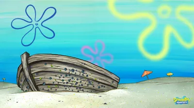

How It Works
Section titled “How It Works”The stacked 3D effect relies on a few key CSS concepts working together:
-
Enable 3D Space
The container element needs
transform-style: preserve-3dso child elements can exist in 3D space rather than being flattened. -
Use CSS Variables
The
<HoverTilt />component exposes--hover-tilt-opacity(animates from 0 to 1) to slotted content via::slotted(*). We use this variable to control the Z translation. -
Animate with
translateZElements use
translateZ(calc(var(--hover-tilt-opacity) * depth))to move forward/backward in 3D space; as the opacity variable animates, so does the Z position. -
Different Depths for Parallax
By giving elements different translateZ multipliers (60px vs 120px), they move at different speeds, creating a parallax effect.
-
Apply a dynamic drop shadow
Elements use
filter: drop-shadow(...);to apply a dynamic drop shadow to the logo and image, utilizing the--shadow-x,--shadow-y, &--hover-tilt-opacityCSS variables.
Warnings
Section titled “Warnings”Preserve-3d Flattening Issues
Section titled “Preserve-3d Flattening Issues”The transform-style: preserve-3d property is essential for this effect. Without it, child elements will be flattened and the translateZ won’t work.
Problem 1: will-change: opacity
Section titled “Problem 1: will-change: opacity”The <HoverTilt /> component sets will-change: transform, box-shadow, opacity by default (helps performance), but will-change: opacity flattens the 3D context.
Solution: Override it on the ::part(tilt) to remove opacity.
hover-tilt::part(tilt) { will-change: transform, box-shadow, mask;}Problem 2: mix-blend-mode (non-normal)
Section titled “Problem 2: mix-blend-mode (non-normal)”The glare layer’s ::before pseudo-element uses mix-blend-mode (default is overlay), which also flattens preserve-3d.
Solution: Set blend-mode="normal" on the <HoverTilt /> component (even if you set glare-intensity to 0).
<hover-tilt blend-mode="normal"> <!-- your 3D content --></hover-tilt>Increasing the depth
Section titled “Increasing the depth”There’s a couple of ways to exaggerate the depth effect;
-
One way is to modify the
perspectiveon thehover-tilt::part(tilt)element. which will affect the depth of the entire tilt effect and give more of a fish-eye style effect the lower you set the perspective. -
Another option is to modify the
translateZon each of the elements inside the container. This will give more of a 3D style effect the further you move the elements away from the background.
Glare blending mode
Section titled “Glare blending mode”If you really need the glare effect to blend with the background, it is possible to re-create the glare manually on a sub-layer that only affects the background.
So instead of using an <img /> or background-image for the background, we can create a new background <div /> and inside of that we can apply the glare effect.
<div class="stacked-3d-custom-bg"> <img src="bikini-bottom.jpg" alt="Bikikin Bottom" class="stacked-3d-bg rounded-2xl" /> <!-- we'll use an ::after pseudo-element to apply the glare effect --></div>Because we are applying a custom glare, we need to set the glare-intensity to 0 on the <HoverTilt /> component so that it doesn’t show the default glare effect.
<hover-tilt  class="stacked-3d [&::part(container)]:rounded-2xl"  shadow  shadow-blur="30"  scale-factor="1.15"  glare-intensity="0"  spring-options='{ "stiffness": 0.08, "damping": 0.15 }'  tilt-spring-options='{ "stiffness": 0.1, "damping": 0.2 }'  blend-mode="normal">  <div class="stacked-3d-content">    <div class="stacked-3d-custom-glare">      <img src="bikini-bottom.jpg" alt="Bikini Bottom" class="stacked-3d-bg" />    </div>    <img src="spongebob-logo.png" alt="SpongeBob SquarePants Logo" class="stacked-3d-logo" />    <img src="spongebob.png" alt="SpongeBob SquarePants" class="stacked-3d-image" />  </div></hover-tilt>
<style>  .stacked-3d::part(tilt) {    /* by default, the will-change list is: transform, box-shadow, opacity */    will-change: transform, box-shadow, mask;    /* we remove the 'opacity' property from the will-change list, because when 'opacity'      is set; the 3d context becomes "flat" and will not allow parallax effects. */  }
  .stacked-3d::part(tilt)::before {    z-index: 1;    /* make sure the glare is on top of the background image */  }
  .stacked-3d-content {    --depth: 60px; /* an arbitrary depth value */    --layer-z: max(var(--hover-tilt-opacity, 0) * var(--depth), 0px); /* max is used so the layers dont go behind the background */    --shadow-opacity: calc(var(--hover-tilt-opacity, 0) * 0.4); /* shadow is hidden when the layer is not active */    --shadow-size: calc(var(--depth) / 5); /* shadow size is 1/5 of the depth */    --shadow-offset: calc(var(--depth) / 8); /* shadow offset is 1/8 of the depth */    --shadow-offset-x: calc(var(--shadow-x) * var(--shadow-offset));    --shadow-offset-y: calc(var(--shadow-y) * var(--shadow-offset));
    /* this is essential for the 3d effect to work */    transform-style: preserve-3d;  }
  .stacked-3d-custom-glare {    /* a wrapper for the background & glare layers */    position: absolute;    inset: 0;    border-radius: inherit;    /*      isolate the background & glare layers from the rest of the container,      this is the most important part so that the 3d stacking context doesn't leak    */    isolation: isolate;  }
  .stacked-3d-custom-glare::after {    /* create a pseudo-element to apply the glare effect */    content: '';    position: absolute;    inset: 0;    border-radius: inherit;    /* apply a radial gradient for the glare effect, using --gradient-x and --gradient-y to position */    background-image: radial-gradient(        farthest-corner circle at var(--gradient-x) var(--gradient-y),        lch(95% 2.7 var(--hover-tilt-glare-hue, 270) / 1) 8%,        lch(88% 5.5 var(--hover-tilt-glare-hue, 270) / 0.75) 28%,        lch(05% 3.5 var(--hover-tilt-glare-hue, 270) / 0.25) 90%      );    /* apply the overlay blend mode to the glare effect */    mix-blend-mode: overlay;    /* dynamic opcity based on the hover tilt variables */    opacity: var(--hover-tilt-opacity, 0);    /* performance consideration */    will-change: background-image, opacity;  }
  .stacked-3d-logo,  .stacked-3d-image {    /* pop the logo and image to the front of the container */    transform: translateZ(var(--layer-z));    filter: drop-shadow(var(--shadow-offset-x) var(--shadow-offset-y) var(--shadow-size) rgba(0, 0, 0, var(--shadow-opacity)));    will-change: transform, text-shadow;  }
  .stacked-3d-image {    /* the image is popped out 2x further than the logo */    transform: translateZ(calc(var(--layer-z) * 2));    /* the image is hidden when the layer is not active */    opacity: calc(var(--hover-tilt-opacity, 0) * 1.2 - 0.1);  }</style>