Pokémon Cards Holographic
Gotta catch ‘em all!
Let’s demonstrate the <HoverTilt /> component applied to Pokémon cards! I’ll show a few examples
of basic cards and some more advanced foil effects if you’re willing to customise some CSS!
Basic card
Section titled “Basic card”We simply wrap the Clefairy card <img /> element inside <hover-tilt> with matching rounded corners. No extra props here, so you get the default overlay blend mode and subtle shadow.
Using TailwindCSS we apply a child-selector border radius ([&::part(container)]:rounded-[4.55%/3.5%]) to the container element, and the inner parts of the web-component will inherit this radius. (see Styling Reference -> Border Radius for more details)
<hover-tilt shadow class="[&::part(container)]:rounded-[4.55%/3.5%]"> <img src="/pokemon/sv3-5_en_035_std.webp" alt="Pokémon #0035: Clefairy" loading="lazy" class="rounded-[inherit]" /></hover-tilt>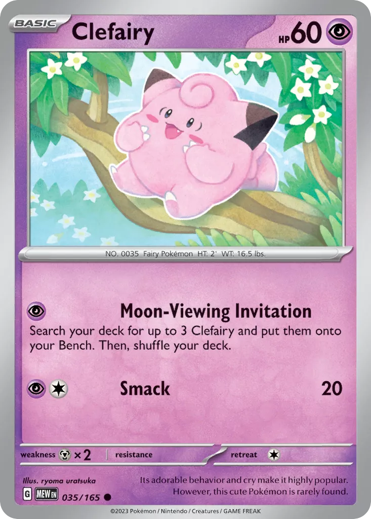
Reverse holo card
Section titled “Reverse holo card”Basic cards often come with a reverse-holo version!
So here we are using the glare-mask prop to point to a PNG that already matches the reverse-holo layout.
Thanks to Malie.io and PKMNCards.com, we have access to scraped images of the foil/etching masks used in the PTCG-Live game.
The masks we got from Malie are luminance-based, so we set glare-mask-mode="luminance" to ensure the glare is only applied to the parts of the card that are not black.
Finally we set the blend-mode to luminosity which combined with
glare-intensity of 4 gives us a nice shiny semi-metallic effect.
<hover-tilt shadow glare-mask="url(/pokemon/sv3-5_en_035_ph.foil.webp)" glare-mask-mode="luminance" glare-intensity={4} blend-mode="luminosity" class="[&::part(container)]:rounded-[4.55%/3.5%]"> <img src="/pokemon/sv3-5_en_035_std.webp" alt="Pokémon #0035: Clefairy Reverse Holo" loading="lazy" class="rounded-[inherit]" /></hover-tilt>Full art Foil card
Section titled “Full art Foil card”Full Art cards have a metallic-style sheen to them, with complex masking.
Setting blend-mode="plus-lighter" lets the foil texture add brightness, while a low glare-intensity keeps the glare controlled. We also point glare-mask to a PNG that already matches the foil layout.
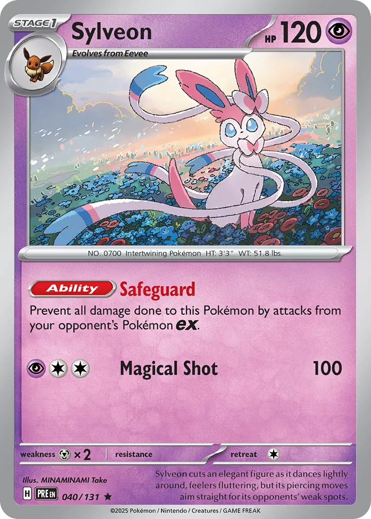
<hover-tilt shadow scale-factor={1.1} glare-mask="url(/pokemon/me1_en_169_std.foil.webp)" glare-mask-mode="luminance" glare-intensity={2} blend-mode="hard-light" class="[&::part(container)]:rounded-[4.55%/3.5%]"> <img src="/pokemon/me1_en_169_std.webp" alt="Pokémon Trainer Lillie (Full Art)" loading="lazy" class="rounded-[inherit]" /></hover-tilt>
ex Holo Card
Section titled “ex Holo Card”To create a card that looks a little like the SV Era ex cards, we can utilise a linear gradient and a star-pattern image, as well as the radial gradient glare.
I won’t explain this fully, but the code is shown below.
The main things to note are;
- creating a new
::afterpseudo-element to apply the holo effect - using the
calc(50% + var(--hover-tilt-x, 0) * 5px)function to move the holo image - applying
mix-blend-modeandbackground-blend-modefor the holo effect
<hover-tilt  shadow  scale-factor={1.1}  glare-mask="url(/pokemon/sv9_en_056_std.foil.webp)"  glare-mask-mode="luminance"  glare-intensity={1.5}  blend-mode="hard-light"  class="ex-holo [&::part(container)]:rounded-[4.55%/3.5%]">
  <img    src="/pokemon/sv9_en_056_std.webp"    alt="Pokémon Lillie's Clefairy (ex Holo)"    loading="lazy"    class="rounded-[inherit]"  /></hover-tilt>
<style>  .ex-holo::part(tilt)::after {    content: '';    position: absolute;    inset: 0;    border-radius: inherit;    background-image:      url(https://poke-holo.b-cdn.net/foils/151/birthday-holo-dank-2.webp),      var(--hover-tilt-default-gradient);    background-size: 120% 160%, cover;    background-position:      calc(50% + var(--hover-tilt-x, 0) * 5px)      calc(50% + var(--hover-tilt-y, 0) * 5px),      center;    background-repeat: no-repeat;    background-blend-mode: color-burn;    mix-blend-mode: soft-light;    opacity: calc(var(--hover-tilt-opacity, 0) * 0.75);    will-change: background-image, opacity;  }</style>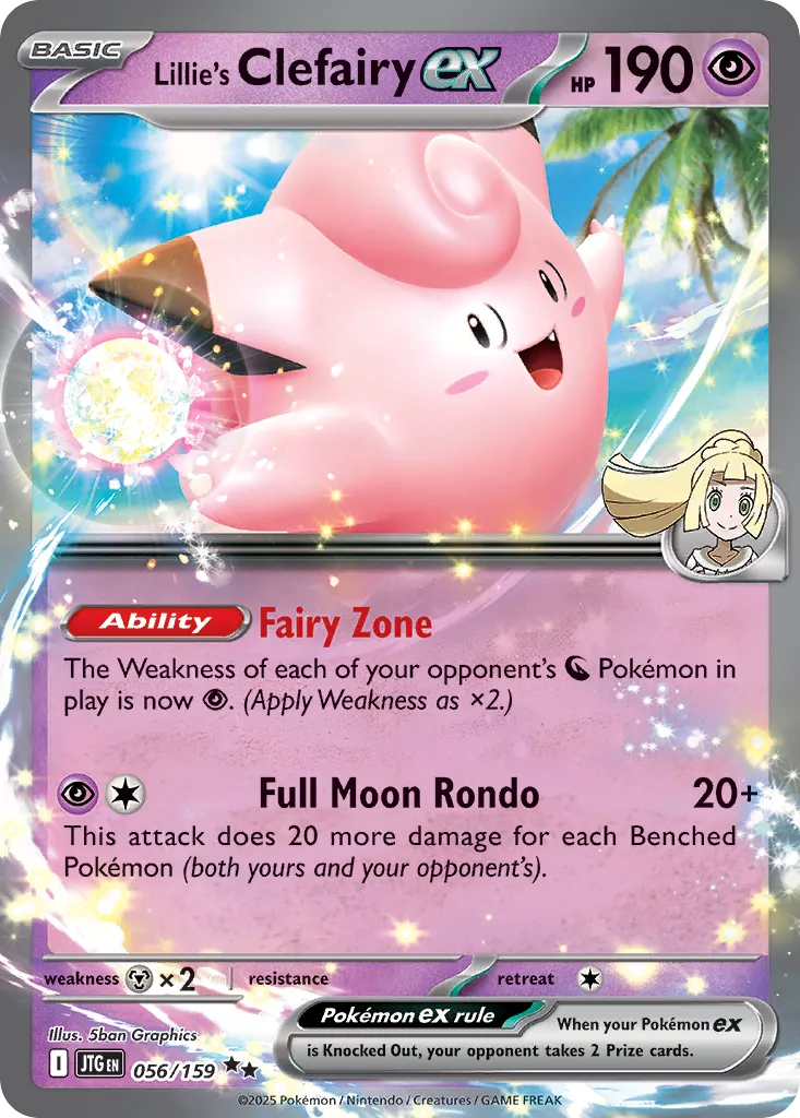
Special Illustration Art card
Section titled “Special Illustration Art card”So here’s a very special, sparkly design!
This type of card has a single foil mask but with some special effects applied to the glare layer with background images and blend modes.
This is not a 100% accurate representation of the real-world card, I have chosen to ignore the ‘etching’ here.
I won’t go into too much detail, but you can see the code and demo below. I’m basically layering three images on top of each other; a rainbow gradient, a sparkles image, and the default glare gradient. When blending effects are applied between these layers we end up with a pretty cool effect!
will-change is used to hint to the browser that these properties are likely to change, so the browser can optimize the rendering of the element.
<hover-tilt  shadow  scale-factor={1.2}  glare-mask="url(/pokemon/sv9_en_184_std.foil.webp)"  glare-mask-mode="luminance"  glare-intensity={3}  blend-mode="hard-light"  class="sparkles [&::part(container)]:rounded-[4.55%/3.5%]">  <img    src="/pokemon/sv9_en_184_std.webp"    alt="Pokémon Trainer Lille's Clefairy (Special Illustration Art)"    loading="lazy"    class="rounded-[inherit]"  /></hover-tilt>
<style>  .sparkles::part(tilt)::before {    --sparkle-rainbow-gradient: linear-gradient(to top left, #f9b3eb, #e2a6fc, #88a2f8, #a2f5a9 90%);    --sparkles-image: url(/pokemon/sparkles.webp);    --sparkles-offset: calc(50% + var(--hover-tilt-x, 0) * 1.5px) calc(50% + var(--hover-tilt-y, 0) * 1.5px);    background-image:      var(--sparkle-rainbow-gradient),      var(--sparkles-image),      var(--hover-tilt-default-gradient);    background-size: cover, 200px 200px, cover;    background-position: center, var(--sparkles-offset), center;    background-repeat: no-repeat, repeat, no-repeat;    background-blend-mode: color-burn, color-dodge;    opacity: calc(var(--hover-tilt-opacity, 0) * 0.6);    will-change: background-image, background-position, opacity;  }</style>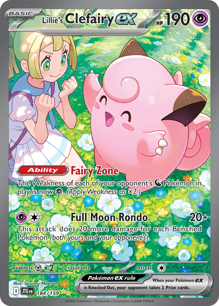
Card with multiple masks
Section titled “Card with multiple masks”The Masterball holo cards have two masks; an etched pattern plus a foil plate.
We use multiple glare-mask values and combine them with glare-mask-composite="intersect" so only the overlapping areas shine.
Here I’m also bumping the glare-intensity, scale-factor and shadow-blur to exaggerate the ‘gallery’ effect!
<hover-tilt shadow shadow-blur={60} scale-factor={1.5} glare-mask="url(/pokemon/sv8-5_en_074_mph.etch.png), url(/pokemon/sv8-5_en_074_mph.foil.webp)" glare-mask-mode="luminance" glare-intensity={4} glare-mask-composite="intersect" blend-mode="luminosity" class="[&::part(container)]:rounded-[4.55%/3.5%]"> <img src="/pokemon/sv8-5_en_074_std.webp" alt="Pokémon #0133: Eevee Reverse Holo Masterball" loading="lazy" class="rounded-[inherit]" /></hover-tilt>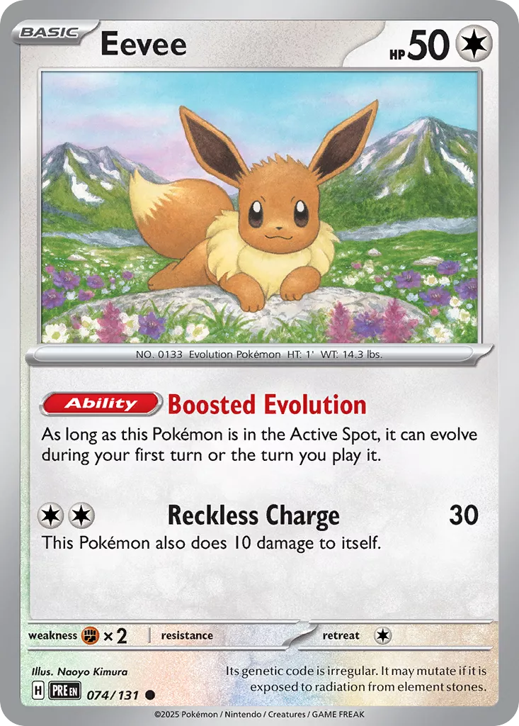
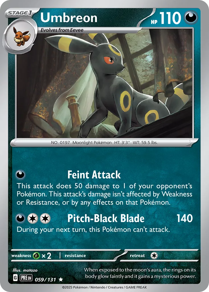
Card with multiple masks (crazy)
Section titled “Card with multiple masks (crazy)”Here’s an alternate version of the Masterball holo taking a slightly different approach.
We still use the same two masks, but instead of applying the “etch” mask to the gradient ::before layer; we instead create a new layer (.reverse-ball-etch) and style definition, and blend the etch image with the radial gradient.
Using hard-light gives it a slightly more metallic shine.
Again, this is a very advanced use-case, but it demonstrates the power of the component and the ability to create custom effects.
<hover-tilt  shadow  shadow-blur={60}  scale-factor={1.2}  glare-mask="url(/pokemon/sv8-5_en_059_mph.foil.webp)"  glare-mask-mode="luminance"  glare-mask-composite="intersect"  blend-mode="hard-light"  class="reverse-ball [&::part(container)]:rounded-[4.55%/3.5%] hover:z-10"  style="--hover-tilt-etch-image: url(/pokemon/sv8-5_en_059_mph.etch.webp);">  <img    src="/pokemon/sv8-5_en_059_std.webp"    alt="Pokémon #0197: Umbreon Reverse Holo Masterball"    loading="lazy"    class="rounded-[inherit]"  />  <div class="reverse-ball-etch"></div></hover-tilt>
<style>
  .reverse-ball::part(container) {    /* create a simple custom gradient for the glare / etch layers */    --hover-tilt-custom-gradient: radial-gradient(      farthest-corner circle at var(--gradient-x) var(--gradient-y),      rgb(237 237 245) 8%,      rgb(13 13 18) 90%    );  }
  /* create a new layer inside the component slot, this is purely so      we can fade the opacity -- as layers with masks cannot set transparency */  .reverse-ball-etch {    position: absolute;    inset: 0;    border-radius: 4.55%/3.5%;    pointer-events: none;    mix-blend-mode: overlay;    /* set the opacity to the same as the glare layer,        so that the etching image is visible while hovered over the card */    opacity: calc(var(--hover-tilt-opacity, 0) * 0.75);    will-change: opacity;  }
  /* place the masked-layers inside the etching layer */  .reverse-ball-etch::before {    content: '';    position: absolute;    inset: 0;    border-radius: inherit;
    /* set the background image to the etching image and the radial gradient */    background-image: var(--hover-tilt-etch-image), var(--hover-tilt-custom-gradient);    background-size: cover, cover;    background-position: center, center;    background-repeat: no-repeat, no-repeat;    /* blend the etching image and the radial gradient in difference mode, so that        the etching image is has a kind of dark/light contrast effect */    background-blend-mode: difference;
    /* mask the etching effect with the radial gradient (glare) */    mask-image: var(--hover-tilt-custom-gradient);    mask-size: cover;    mask-position: center;    mask-repeat: no-repeat;    mask-mode: var(--hover-tilt-glare-mask-mode);    will-change: background-image, mask-image, opacity;  }</style>