
Credit Cards
Let’s create some credit cards!
We will use a <img /> with the credit card image as the background (slot-content), and let’s also do a version where the glare is masked by a fancy pattern to give it some zesty flair!
Basic Credit Card
Section titled “Basic Credit Card”Here we put an image of a Credit Card inside the <hover-tilt> element, and use the component-props to make it pop!
We want a really pronounced glare effect to make it look metallic, so we set the glare-intensity to 3. Also we make it pop out of the frame with an exaggerated scale-factor of 1.15. Border radius is set to 4%/6% to match a credit card’s rounded corners in a responsive manner.
<hover-tilt class="[&::part(container)]:rounded-[4%/6%]" shadow shadow-blur={30} scale-factor={1.15} glare-intensity={2.5}> <img src="/assets/amex-platinum.webp" alt="Credit Card" class="rounded-[4%/6%]" /></hover-tilt>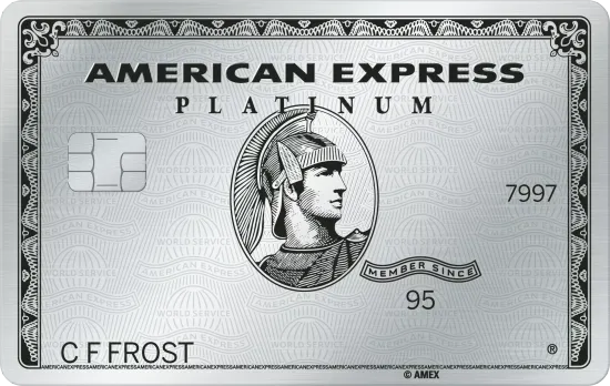
blend-mode being set to overlay by default. You can change this with the blend-mode prop. Credit Card with Glare Mask
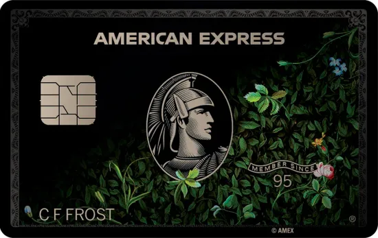
Section titled “Credit Card with Glare Mask”Here we add a glare-mask to the <hover-tilt> element, tweak the glare-intensity and set the blend-mode to difference to get a more interesting effect.
The glare-mask is a transparent PNG with the American Express “world service” logo repeating pattern.
<hover-tilt class="[&::part(container)]:rounded-[4%/6%]" shadow shadow-blur={30} scale-factor={1.15} glare-intensity={0.5} glare-mask="url(/assets/amex-pattern.webp)" blend-mode="difference"> <img src="/assets/amex.webp" alt="Credit Card" class="rounded-[4%/6%]" /></hover-tilt>Default settings
With Glare Mask
Adding a clip-mask to the glare
Section titled “Adding a clip-mask to the glare”The edges of the card look a bit strange with the pattern glare applied. Let’s clip the glare mask to the edges of the card to give it a nice matte border effect.
Using a bit of CSS we can also target the .tilt::before pseudo-element to clip the glare mask to the edges of the card. This will give us the desired matte border effect.
TailwindCSS doesn’t support CSS clip-path yet, so we have to use plain CSS in this scenario.
<hover-tilt  class="clipped [&::part(container)]:rounded-[4%/6%]"  shadow  shadow-blur={30}  scale-factor={1.15}  glare-intensity={0.5}  glare-mask="url(/assets/amex-pattern.webp)"  blend-mode="difference">  <img    src="/assets/amex.webp"    alt="Credit Card"    class="rounded-[4%/6%]"  /></hover-tilt>
<style> .clipped::part(tilt)::before { clip-path: inset(8% 5.5% 8% 5.5% round 4% 6% 4% 6%); }</style>Clipped Border
Masking out the secuity chip
Section titled “Masking out the secuity chip”Going even further, we can use a more advanced polygon() syntax to clip out the chip from the glare mask, too!
This could also be done by editing the glare-mask image so it already has a blank area for the chip.
<hover-tilt  class="clipped-with-chip [&::part(container)]:rounded-[4%/6%]"  shadow  shadow-blur={30}  scale-factor={1.15}  glare-intensity={0.5}  blend-mode="difference"  glare-mask="url(/assets/amex-pattern.webp)">  <img    src="/assets/amex.webp"    alt="Credit Card"    class="rounded-[4%/6%]"  /></hover-tilt>
<style> .clipped-with-chip::part(tilt)::before { clip-path: polygon(5.5% 8%, 5.5% 95%, 11% 95%, 11% 32%, 26% 32%, 26% 52%, 11% 52%, 11% 95%, 94.5% 95%, 94.5% 8%); }</style>Clipping the Chip
Going holographic!
Section titled “Going holographic!”Let’s go a bit crazy and add some custom CSS to really make things extra!
Explainer and Demo below the code block! ↓
Adding a holo/rainbow gradient
Section titled “Adding a holo/rainbow gradient”<hover-tilt class="clipped-with-chip holo [&::part(container)]:rounded-[4%/6%]" shadow shadow-blur={30} scale-factor={1.15} glare-intensity={1} blend-mode="hard-light" glare-mask="url(/amex-pattern.webp)" glare-mask-mode="alpha" glare-mask-composite="intersect"> <img src="/assets/amex.webp" alt="Credit Card" class="rounded-[4%/6%]" /></hover-tilt>
<style> .clipped-with-chip::part(tilt)::before { clip-path: polygon(5.5% 8%, 5.5% 95%, 11% 95%, 11% 32%, 26% 32%, 26% 52%, 11% 52%, 11% 95%, 94.5% 95%, 94.5% 8%); } .holo::part(tilt)::before { mask-image: var(--hover-tilt-glare-mask), var(--hover-tilt-default-gradient); background-image: linear-gradient(to top left, #f9b3eb, #e2a6fc, #88a2f8, #a2f5a9 90%); background-size: 300% 300%; background-position: var(--gradient-x) var(--gradient-y); } .holo::part(tilt)::after { content: ''; position: absolute; inset: 0; pointer-events: none; background-image: var(--hover-tilt-default-gradient); mix-blend-mode: hard-light; opacity: calc(var(--hover-tilt-opacity, 0) - 0.75); will-change: opacity, background-image; }</style>Holographic
Breakdown
Section titled “Breakdown”Let’s break down the extra holographic bits step-by-step!
-
First we add the
.holoclass to the<hover-tilt>element. -
Next we modify the
glare-mask-modetoluminanceas we will be using 2 masks here. -
We also set the
glare-mask-compositetointersectto ensure the 2 masks are combined correctly. -
Inside of the
::beforewe re-assignmask-imageto use both the--hover-tilt-glare-maskand the--hover-tilt-default-gradientCSS variables.This is now our ‘hologram’ mask layer instead of glare layer. This will allow the mask to follow our cursor, just like the glare gradient does.
-
We apply a rainbow-gradient
background-imageto the::beforepseudo-element and set the position to the cursor with--gradient-xand--gradient-yCSS variables.This allows the rainbow to move a little bit giving a more realistic holographic effect.
-
Now we create a new pseudo-element
::afterwhich will hold the new glare effect.We set a common
content: '',position: absolute, etc to ensure this layer covers the.tiltelement. -
Finally we are applying the
var(--hover-tilt-default-gradient)to thebackground-imageand set themix-blend-modetohard-lightto ensure the glare effect is visible.Also setting
opacitytocalc(var(--hover-tilt-opacity, 0) - 0.75)reduces the glare’s power.
Again; this is very extra, and I expect only a few very eager users may want to go into this much detail. In reality
they may want to create their very own custom component instead of using <HoverTilt />. But if they have the desire they could start with <HoverTilt /> and use the CSS variables to create their own glare/holo design!